6 pivot table examples to increase data analysis efficiency
Why pivot?
Big data is only helpful when it is efficiently and effectively analyzed. One major barrier to effective analysis is that the number of metrics advertisers want to use simultaneously makes the data harder to manipulate. Fortunately, there are tools like Excel that make this process easier and every major PPC advertising UI has an option to export data into Excel.
One of the best tools within Excel for data analysis manipulation and analysis is the pivot table. The pivot table allows for two major types of PPC data analysis:
- One category with aggregated data for multiple metrics
- Two categories with aggregated data for one metric
The key word in each of those types is “aggregated”. Pivot tables trump Excel’s basic filtering options when the data involved has certain categories that are listed in multiple rows. An example that PPC managers are familiar with is search query reports. If an account manager downloads an AdWords search query report that includes keywords, the same search query might appear in multiple rows if it matched to multiple keywords. Each unique search query and keyword pairing receives its own row in the AdWords report. A pivot table can aggregate metrics (like clicks or impressions) based on the search queries so that each is only listed once.
PPC advertisers need to analyze aggregated data on a regular basis, whether it is for search query reports, geo bid modifiers, or conversion type analysis. This whitepaper includes multiple examples of each type of analysis by using PPC-specific examples. These examples are more general for the sake of showing broad-use cases. There are hundreds of other ways to look at PPC data with a pivot table, depending on account goals, budgets, and size. The following pivot tables are meant to serve as ideas to help any PPC manager brainstorm new ways to analyze existing data to find meaningful takeaways for their companies or clients. For PPC managers that want a lesson in building one of these pivots, check out this blog post from PPC Hero.
Types of pivots
1. ONE CATEGORY WITH AGGREGATED DATA FOR MULTIPLE METRICS
Search Query Reports
Search query reports are one of the most common “one category – multiple metrics” pivots for paid search analysts. Search query reports from AdWords can be lengthy and semi-repetitive. A pivot table allows a PPC manager to aggregate metrics based on the search query instead of seeing one row of metrics each time that a search query matched with a different keyword. Below is an example from the blog post listed above.
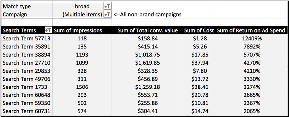
The “one category” is the field “Search Terms” from the AdWords data. There are multiple metrics (listed as “values” in the pivot table builder) aggregated by Sum for each search term. This pivot table is aggregating all impressions, revenue, and spend for each search term into one row. Then, the account manager can add a calculated field, like ROAS or CPL, based on the newly aggregated data to determine which search terms are meeting or exceeding goals across all keywords in the account.
Placement Reports
PPC account managers can also use One Category – Multiple Metrics pivot tables to efficiently run placement audits based on the placements export from AdWords. Like search query exports from AdWords, display placements and their metrics will be listed separately for each campaign and ad group combination that contained the placement. A quick pivot table of that data will allow a PPC manager to see how a placement performs across all campaigns, as opposed to one campaign.
2. TWO CATEGORIES WITH AGGREGATED DATA FOR ONE METRIC
There are several types of pivot tables that fall into the Two Categories – One Metric group. Those listed below are based on data from the Dimensions tab of AdWords, but there are dozens of other data sets from various platforms that could be pivoted to find meaningful takeaways.
Geographic Analysis

In the example above, the account manager is analyzing cost-per-lead by state and campaign. The Grand Total represents the CPL for each state, across all the campaigns. Adding conditional formatting to this pivot gives a nice visual representation of how each campaign’s CPL in each state compares to the average CPL for that state. The reverse could be done with a totals row across the bottom of the pivot. In that scenario, the conditional formatting would be applied vertically, to each campaign, which would create a visual comparison of each state’s CPL per campaign compared to that campaign’s overall CPL.
Day of Week Analysis
Before:
After:
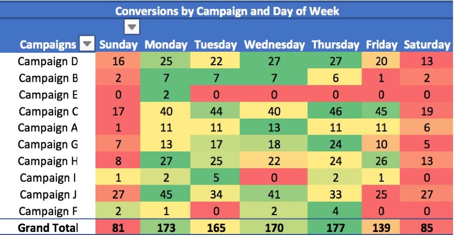
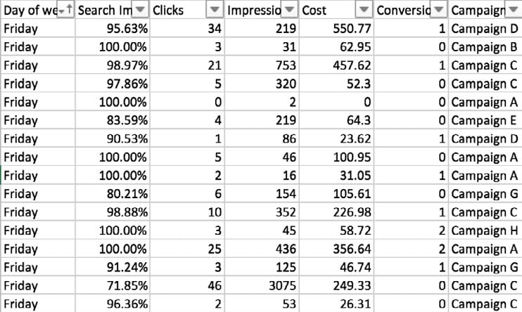
The pivot table + conditional formatting method is also very effective for day-of-week analysis, as can be seen in the before and after comparison above. Conversions are aggregated by campaign name and day-of-the-week in the second pivot. When the conditional formatting is applied horizontally, across the campaign rows, the result is a visual representation of the best and worst conversion days for each campaign. Plus, this pivot could help identify if there is a trend across all the campaigns. It’s clear from this pivot table that Saturday and Sunday are the worst conversion days overall. This pivot would support the need for negative bid adjustments for the weekend, and it does so in a clear and effective way that an account manager can pass on to a client or a supervisor.
Conversions Segmented by Name
Before:
After:

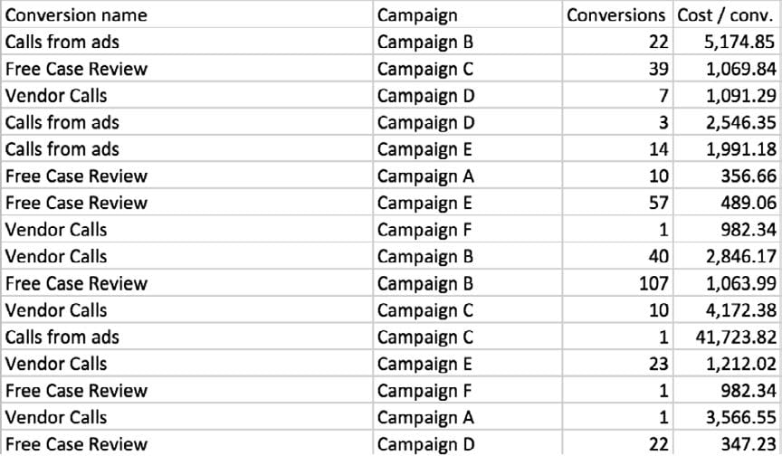
This Two Categories – One Metric pivot is best for PPC accounts that are tracking more than one conversion type. While this data set came from AdWords, conversion or lead types can be segmented in a variety of PPC platforms. Below is an example of leads from Facebook segmented by the carousel images from which they came.

This pivot table allows the advertiser to compare carousel card performance across two or more ad sets. Depending on the purpose of the analysis, the takeaways vary. If the advertiser is interested in which images generate the most leads overall, the grand totals for the rows suggest that image #1 is the winner with 21 leads. If the advertiser is more interested in the audience alignment for each ad, the conversions suggest that image #1 works best for Facebook Ad Set #12 while image #4 works best for the targeted audience in the second ad set.
Conclusion
Data analysis is critical for PPC advertisers. While there are many tools and platforms that can help, Excel pivot tables are often the most efficient and effective. Most PPC platforms export data into Excel, so the types of analysis that PPC managers can do with pivot tables are numerous. The pivot tables listed in this whitepaper just scratch the surface and should be used as inspiration for more in-depth and creative pivots!


